Thursday, 14 April 2011

Wednesday, 13 April 2011
Evaluation Question 7: Looking back from your preliminary task, what do you feel you have learnt in the progression from it to full production.
Preliminary Task:

Final Product:


Research and Planning:
At the beginning of the AS course, I was assigned a preliminary task, to create a magazine for college students. When looking back at my earliest Blog posts it is clearly evident that I had not put much thought at all into my product in terms of research and planning. I did not look at other professional products until I began my preliminary evaluation, Therefore I created my product very carelessly, not thinking about what would appeal to my target audience. Looking back at my preliminary product presented above, I think that it's possible to see that I did not put much effort in my research and planning as it genuinely does not look like a college magazine. Now that I have a better trained eye for textual analysis, I'd say that it looked like I was trying to make a fashion magazine. Which is evident when comparing my preliminary product to Vogue. Like so:

When looking back at my main task, it is evident that I had taken a completely different approach to my research and planning. I researched every little detail of current products associated with the genre of magazine I wished to create. For example I took note of what colours I should use for my magazine. When I constructed my textual analysis, I found that Rock Magazines such as NME used a three colour palette of: black, white and red to construct a visual representation (naughty but nice) of their target audience. After learning how colours can create a visual representation I used this convention in my final product. Whereas, in my preliminary task, i used three colours for the sake of using three colours, without acknowledging colour connotations or a three colour palette rule. Another key difference in terms of my research and planning is that I also taken into consideration which fonts i should use and why, this is evident as I created a Blog post dedicated to this. Whereas in my preliminary task, again, I chose the fonts because of my own personal preference. Not because it represented my target audience. As I also learnt when constructing my textual analysis fonts are also a key factor for constructing a visual representation of my target audience. For instance the rugged effect on Kerrang!'s masthead suggests the target audience live an "edgy" lifestyle and distance themselves away from mainstream fashion and music. After learning this convention, it influenced me to use it in my final product. In contrast, it's evident that I didn't look into font styles in my preliminary task as the masthead doesn't really connote anything about college life.
Another key skill that I had learnt from progression is definitely time management. I think it's quite evident I spent less time constructing my preliminary task as it does look very rushed, especially the contents page. As my banners are out of proportion as are my images. Whereas I taken a lot of care into producing my final product as I spent a lot more time constructing my final product. When working on my final product I also managed my time a lot better, as I have generally spent all of my free periods and time after college in the college library working on my Blog and products. Whereas when I did my prelim task, I only used the hours in my media lessons. Using all of my time wisely has benefitted me as it has allowed me to create a more professional looking product, and it has also allowed me to do my research and planning thoroughly, which will hopefully score me a significantly higher mark, than the mark I achieved in my preliminary task.
I also became much better at organising myself and planning my time wisely. For instance during production of my main task I created my own production schedule in a blog post which I had strictly adhered to, which involved me working some significant hours out of college too. In contrast, during my preliminary task i did not organise myself efficiently and effectively, I didn't create a production schedule, and I didn't plan my time wisely. By gaining the skill of time management, it has benefitted me in the following ways: I never missed a deadline, and I never had to frantically rush about doing my work at the last minute. I am very grateful for learning this skill of time management as it is a skill that I have been able to transfer across to the rest of my A Level subjects.
Construction:


When analysing my preliminary products and my final products it is obvious that my skills in PhotoShop and InDesign have improved immensely.
It is evident that I had learnt how to compose a photograph better, when constructing my final product I was aware of how to use a light meter, and how to set the shutter speed on the camera. This meant that my photographs were not over or under exposed.
When comparing my final product to my preliminary product, it is evident that my editing skills have also improved. For example, on the front cover of "Bonanza" it's evident that i cut my model out from the original image, especially when you look at the model's hair. In my final product I also attempted some new editing skills, such as airbrushing the model on my front cover. Another way that I improved is that on my final product, I learnt how to position my model in front of the masthead whereas during my preliminary task I was unsure of how to this. By positioning my model in front of my masthead, it shows that my product is in line with those of professional practise, as many rock magazines such as Rock Sound and Kerrang! often position their model in front of their masthead to show that, not only do they have the confidence to hide their masthead and have people still know what magazine it is, they also value the people featured in the magazine.
In my preliminary task, all my sell lines are the same size and it's very difficult to tell which is the main sell line (Though I always claimed that the Auchwitz one was the main sell line in my prelim evaluation!) looking back all my sell lines are the same size and there is no variation. Whereas on my final product, I made my main sell line dominate the centre of my page. I also experimented with some banners and puffs too. Which again shows that my construction skills have improved, and it also shows that I have paid attention to professional products who don't just have the same sized sell lines positioned across the front cover.


When comparing my contents pages. It is evident that my construction skills have improved using Adobe InDesign. During my Preliminary task, I was very unsure of how to use the software. I think this is evident through the fact that there is no colour whatsoever on the contents page, whereas when constructing my final product i learnt how to add colour using InDesign. Additionally My banners appear to be all different sizes too which makes the product look very unprofessional. It's evident that I also experimented with a completely different layout in my final product which looks very similar to the layout of professional products such as Kerrang! Furthermore I also learnt how to keep my images in alignment with one another when constructing my final product. Whereas, I was very careless in the preliminary task, you can see that I had my three images all different size, and the middle image even overlaps my text!
Although I did not construct a Double Page Spread in my preliminary task, i did produce a double page spread for my final product. I still believe that it shows that my InDesign skills have improved, since I began my preliminary task. Again it shows that I have been able to add colour and even change my background colour. Two skills i did not acquire in the preliminary task, furthermore it shows that i can confidently align photos unlike in my preliminary task where I mentioned before how one of the images overlaps my text!
Conclusion
In conclusion, as I progressed from my preliminary task to creating my final product, my research and planning and construction skills have greatly improved and have allowed me to create a final product which looks profession and will hopefully score more marks than my Prelim product. Additionally I think the new skills I have acquired and learnt from my preliminary task to final production will benefit me when i continue to A2 Media Studies next year.
Sunday, 10 April 2011
Evaluation Question 6: What have you learnt from technologies from the process of constructing this product?
Here is a brief montage outlining all of the technologies I have used throughout the process of constructing this product:
Evaluation Question 6.
View more presentations from gjdsweeten
Wednesday, 6 April 2011
Evaluation Question 5: How did you attract/address your audience?
Evaluation 5 on Prezi
In order to make my magazine as appealing as possible to my target audience, i made ammendments to my product throughout production, here is a slide share which explains the ammendments I have made.
In order to make my magazine as appealing as possible to my target audience, i made ammendments to my product throughout production, here is a slide share which explains the ammendments I have made.
Here is some audience feedback i constructed to find out what attracts my target audience:
I asked my target audience the following questions:
1)What draws your attention to my product?
2)What genre do you think my magazine belongs to?
3)What are the strengths of my product?
4)Who does my product represent?
5)Would you purchase my magazine?
6)How would you improve my product?
I asked my target audience the following questions:
1)What draws your attention to my product?
2)What genre do you think my magazine belongs to?
3)What are the strengths of my product?
4)Who does my product represent?
5)Would you purchase my magazine?
6)How would you improve my product?
1) Masthead draws attention especially the rugged effect
The rugged effect and black and red colours suggest the rock genre as does the picture
2) Rock Genre
3) Strength: Model and masthead, very consistent with colours
4) Represents the rock social who group who are on their way to adolescence
5) Would purchase as it's a good product to buy as it relates to me
6) To improve the product, remove the white space.
1) Masthead
2) Rock genre suggested from masthead and model
3) Set out very well, not too much white space
4) The masthead and the front cover
5) Emos through the masthead and clothing
6) Wouldn't buy it as it isn't my genre
1) The centrally positioned masthead and the brushes at the bottom, colours on the contents page,
2) Rock Genre can tell by the masthead,
3) The contents page - the writing and how it's laid out
4) Punk people
5) Wouldn't personally purchase the magazine
6) Not too sure about the brushes on the front cover
1) Really like this product, all the colours are bright it looks creative
2) Rock Genre
3) Bright Colours against the black background on DPS. Professional Photography can clearly tell its a rock magazine
4) Emo/Indie/Scene Kids
5) Would purchase it really professional
6) May have used different locations for Posters featured on contents page
1) The colour scheme, it's in your face, it's really good
2) Rock Genre can tell this through the: eye makeup, headphones, black nail varnish
3) Layout and colour scheme
4) Emo Kids
5) Wouldn't purchase it as I don't like Rock Music
6) Would have had the writing on the left hand side on DPS
1) Dominating image on the front cover, overlaps the masthead
2) Rock/Niche genre can tell by the models
3) The colour scheme grabs the reader's attention everything is colour
4) It represents Scene Kids
5) Wouldn't buy it
6) Would improve the double page spread as there isn't enough continuity
By using the feedback, I have created my own animated focus group:
GoAnimate.com: MEDIA INTERVIEW by gsweeten
Like it? Create your own at GoAnimate.com. It's free and fun!
By using the feedback, I have created my own animated focus group:
GoAnimate.com: MEDIA INTERVIEW by gsweeten
Like it? Create your own at GoAnimate.com. It's free and fun!
Monday, 4 April 2011
Evaluation Question 4 Who would be the audience for your media product?
By using Glogster, I constructed a visual representation of the characteristics of my target audience.
Please click here to view my Glog.
My Glog shows the hobbies, interests and lifestyle of my target audience. When referring back to my initial audience research, constructed in January. I said that the average age of my audience would be 19, there would be an even split of gender in terms of who purchased the magazine, they would generall be students, who enjoy the rock lifestyle, their socio-economic status would be working to Lower-middle class and they would be: media savvy, up to date with modern technologies and appreciat their individuality. I think my product would succesfully live up to the standards of my target audience, as I have featured content that would appeal to them, used models of a similar age they can relate to, and the languag feautured appeals to those who are working to Lower-middle class, for instance i used colloquialism and included profanities.
Thursday, 31 March 2011
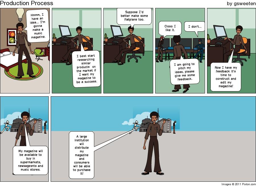
Evaluation Question 3: What kind of media institution might distribute your media product and why?
A brief overview of the production and distribution process. (Created on pixton.com)

Evaluation 3 on Prezi
It's also important to know how my product would be advertised, here is a video I created which explains how it would be advertised.
It's also important to know how my product would be advertised, here is a video I created which explains how it would be advertised.
It's also important to know how the product would be distributed, here is a video where I explain how my product would be distributed.
My product would generally distributed in supermarkets amongst other magazines, as supermarkets are a popular distributor, likewise WHSmith is a very popular store that distributes magazines, therefore by distributing in WHSmiths potential consumers could see my magazine amongst other music magazines. With the emergence of web 2.0 it's also likely that my magazine would be available via an online subscription, this would be beneficial for the "hardcore" purchasers of my magazine who can get a subscription either yearly or monthly, which would work out cheaper than purchasing the magazine from various stores. Thursday, 24 March 2011
Evaluation Question 2: How does your media product represent particular social groups?
Although the target audience for my media product was generally aimed towards the Rock and Indie kid social group. I feel as though my product also represents Scene and Emo Kids instead.
Here are some videos from find your tribe which explains these particular social groups:
I also created a "Wordle" which describes the Emo Kid stereotype.The bigger the word presented, the higher the word is associated with the stereotype, as you can see words such as "music and bands" appear, which suggests they may find my magazine appealing.

I also created a "wordle" for the scene kid stereotype again words such as music appear, however as the word Scene is very large, it suggests the also value who they are very highly

So how did my magazine represent social groups? Here is a video I created which will tell you.
Here are some videos from find your tribe which explains these particular social groups:
I also created a "Wordle" which describes the Emo Kid stereotype.The bigger the word presented, the higher the word is associated with the stereotype, as you can see words such as "music and bands" appear, which suggests they may find my magazine appealing.
I also created a "wordle" for the scene kid stereotype again words such as music appear, however as the word Scene is very large, it suggests the also value who they are very highly
So how did my magazine represent social groups? Here is a video I created which will tell you.
Thursday, 17 March 2011

Friday, 4 March 2011
Rough Cut Feedback and Reflection
After completing my rough cuts, i pitched my products to my Teachers and peers. Here is the feedback that my teachers gave me.


My peers generally gave me the same feedback as above. It seems as though my main images used on my DPS appear to be stretched, and this could potentially make me lose some vital marks. Therefore the next step I'm going to take is to make these changes in order to improve my final product.
Thursday, 3 March 2011


Monday, 28 February 2011
Photoshoot: Double Page Spread
Here is my photoshoot for my Double Page Spread.
I decided to shoot my images in a black and white filter, for my double page spread to fit in with the three colour pallete of black, white and red that I am using in my DPS.


Here is another image of my model which is in mid-shot. I am going to use this image as one of the smaller images as I think it will work well. It suggests that there is an element of elagance within the artist. This is common aspect of a female rock artist.


Here is another image I am considering using for my main image on my DPS, as I think it shows what the artist is all about. However i may disregard it as I think a centrally framed image would work better.

Here is another image which i may use for either my main image or a smaller image. I particularly like this image at the body language is not as serious as the other images and it shows that the artist can still have fun and be quite childish, which is very refelective on the content featured in the article
Wednesday, 16 February 2011
Photoshoot: Contents Page
After shooting my model for my contents page here are some of the images produced:
For all photos, I made my model wear headphones as prop to suggest that the artist was very passionate about their music.


For all photos, I made my model wear headphones as prop to suggest that the artist was very passionate about their music.

Here is a potential image for my contents page. My model is in medium close up. However, I feel as though this image will not be suitable for my contents page, mainly because I feel as though the body language presented on the photo is too childish, especially since my target audience reaches those over 18.

Here is another potential image for my contents contents page. Again the model is in Medium close up. And again, I feel as though the body language doesnt represent my target audience. And I think the mischevious face doesn't really share the same connotations of a Rock/Indie artist.

Here is another image for my conents page. I decided to try and shoot some photos in Landscape this time. I think this image works well in terms of her facial expression and bodylanguage. Therefore, I feel as though this image would work well in my contents page.

Here is another potential image for my contents page. However, I don't particularly like this image as i feel as though the body language conveys a "Little Miss Nice" image, and that is not what the Rock/Indie culture is about. Therefore if i was to use this image in my contents page it may be unappealing. to my target audience

Here is a final image for my contents page. However I think this image isn't professional enough to be used into a contents page as I cut half of her arms off and she is positioned too low down. Therefore if this image was to be featured in a contents page it would be unprofessional and unappealing and it could potentially put the readers off from purchasing the magazine.
Photoshoot: Front Cover
After photographing my model for my front cover here are the images produced:


Here is my model in midshot. I think this photograph works well and would be representative of a Rock Magaine, if I decide to use this image. I think that the the facial expression is very similar to expressions used by artists who have previously featured in rock magazines such as: Kerrang!, Rock Sound and NME. The model's eye also matches with the readers, so again if I was to use this image, eyeline match would be present which is a common feature with all magazines.

Here is another potential front cover image for my magazine. The body language and expression suggests that the model is rebellious, angry, offensive and full of angst. The characteristics match the same of those who prefer to read a Rock Magazine. Therefore if this image was to be used on my front cover the target audience would be able to identify themself with the model.

Here is another image of my model I had taken for my front cover. However, I feel as though this image wont work as a front cover image because there is no eyeline match the reader won't be able to identify themself with the model featured, and as a result they won't feel personally connected with the magazine, thus meaning it would be less likely for the reader to purchase the magazine.

Here is my final image which I had taken for my front cover. I decided to shoot an image of my model where her body language suggested that she was a strong and powerful figure which is another common occurance in rock magazines. However, as I had cut part of her elbows off in this image, I therefore think that this image would not be suitable for a magazine as the image does not look professional enough.
Monday, 14 February 2011
Editor's Note: First Draft
Below is a draft of what my editor's note in my final product will look like.
WOW! WHAT A blast it's been producing this issue for you guys this month! I'm sure you're going to enjoy it as much as we have produced it. We caught up with rock's new queen: Paige Valentine from Symphony Ancient, armed with a stack of questions. It was one hell of an explosive interview and you really do not want to miss it. Turn to page 24 to see how Miss Valentine coped with our questions. We also gatecrashed Stepping Deception to see how they're getting on preparing for world domination, page 40. We're also holding a (free) competition for you crazy bunch where you can win a signed, yes signed guitar! You'd be mad to miss it. So yeah, it's been a total blast creating this magazine and I hope you enjoy reading it. Feel free to send your feedback Rock Out! values their readers and we always love to hear back from you. Until next issue!
George Sweeten
Editor of Rock Out!
Editor's Note Plan
Although I did not include an editors note in the contents page of my flat plan. I have found that a common feature in the contents page of any magazine is that they have a note from the editor. The editor's note sums up the thoughts and feelings of the editor and show's how they feel about how the production of the issue went. It also works as a teaser for the reader as it tells the reader what to expect in the issue.
The use of language in the editors note of "Kerrang!" (which I am referring to for inspiration) is very informal and it represents the language that the generic target audience would speak. This is so that the reader, again feels personally connected with the editor which again works in unison with every other aspect of the magazine, to make the reader feel as though the magazine has been designed personally for themselves and only themselves. Examples of the use of informal language used are: "Wow", "Yeah, Yeah" and the editor also uses profanities such as "We went batshit crazy with loads of you lot" it is also evident here that the editor is personally directing the reader again. The editor will have chosen to use profanities as it's likely the target audience use them too. Therefore the editor uses the style of language that the reader speaks so that the reader can identify and relate to the magazine. As my magazine's target audience is very similar to Kerrang's target audience I am going to try and replicate this.
The editor's note is short in words as there is no less than 100 words. The editors note is short in words, is so the reader doesn't lose interest, and it should not dominate the contents page, as the reader needs to acknowledge the content of the magazine so that they are aware that they are getting value for money. As I am also trying to make my reader feel as though they are getting value for money, I need to again, try and replicate this.
The editor's note also features a small photo of the editor, as I am the editor of the magazine I will need to ask one of my models to take a photo of myself in the studio to include in the editor's note.
The editor has also drawn in their signature at the end of their note so I will need to include this too.
Monday, 7 February 2011
First Draft: Article
After planning how my article is going to look and what it's going to look like. The next step is to write my first draft which is presented below:
Symphony Ancient's Superstar Paige Valentine Speaks Exclusively to Rock Out!
On a cold February morning, sat in Rock Out! HQ eagerly awaiting to meet rising star, Paige Valentine from Symphony Ancient. I honestly had no idea what to expect. After being held up in traffic, Valentine arrived and she certainly caused a scene. "I'm a girl i have to be fashionably late" she said with a cheeky smile. All i knew for sure, was that this was going to be one hell of an explosive interview, that I'll never forget.
These days, as I'm sure you're aware it's incredibly hard to make it into the music industry, how did your band become a success so easily?
Easy? Ha, what an understatement! Trust me, it was such a battle. Before we got our contract, we would perform at local venues for free and sell our EP's and I would only make enough money that meant I could only just afford to live off beans every week. Then one night after one of our concerts, I can't remember the guys name, he seemed a bit of a fanboy but he recommended we should set up a MySpace page so that "The Wider" audience could listen to our tracks. Funnily enough, we became a success overnight. So if it wasn't for MySpace it's safe to say I'd still be living of beans performing to a crowd who doesn't give a f**k, so thank you MySpace! It could have been worse, Simon Cowell could have found me and turned me into someone i'm not.
So I take it you're not a fan of how reality shows can create a rising star overnight?
When you had to work your ass of like the guys and I did to be where we are today? Hell no! haha. I can't understand how people can even enjoy those reality shows, all they do is take an artist who has potential and then Simon Cowell models them into how he wants, by turning them into a bland, dull artist. I like to call those from reality shows, designer babies of the music industry, haha.
Who are the main bands that influenced Symphony Ancient?
I wouldn't say I'm influenced by anyone, I'll listen to other artists and think, yeah... I like that he's cool. But I wouldn't say I'm influenced by anyone, but that's just my opinion. Ask the guys that question and they'd probably give you a completely different answer. What does really irritate me is when I go to an interview, the interviewer does no research and just assumes we're like Evanescence because I'm a "Gothic" chick in a rock band. As far as I'm aware, we sound nothing like Evanescence. I can't help but get p****d of when I get compared to Amy Lee. I'm sure she'd feel the same way about me.
Not a fan of her then?
Yeah, she's cool. It's nothing personal, I just don't think I'm anything like her.
Describe your experience recording the new album:
Well for the majority of the time, I stay out of the way until the final processes of the album. The guys record their drums, guitars and whatever first. Then I provide my voice. It's certainly a stressful process, lots of things go wrong. I might not be happy with how a song sounds, my voice might break and so forth. We had to record endless demos so it's a very long process. But trust me, it's so worth it in the end when you see your album up in the shelves in HMV. I often want to tell people stood in the store to go buy my album, they'd probably think I'm a freak and smack me with their handbags or whatever though. But hey, imagine their faces when the see me on the TV and they'd be like: "I hit her with a bag in HMV". That would be certainly one to tell the grandchildren! God, I sound big headed now.
So you don't think you have quite the ego then?
Of course not. Anywayyy moving on?
What can we expect to see at your live shows?
Sex, drugs and rock "n" roll. I joke, there'll certainly be no sex and drugs. But there'll certainly be plenty of rock, passion, angst, fire and possibly boobs too. No, I'm joking, I don't think I'd be up for flashing myself in front of a crowd. Okay, maybe if I was drunk, but I'll never drink before a show incase I make a tit of myself. But seriously, If you like rock artists who feel real passion when performing. Come see us! Otherwise, I'll be living off beans again, and we don't want that do we?
Speaking of drugs, you're quite open about your drug addiction battle when you were a teenager, what would you say to anyone who is currently in the situation you were in?
I was in such a dark place when I was a teenager. I had no-one to turn to for support, I had a bad relationship with my family. I didn't really "fit in" at secondary school and unfortunately the only thing I could turn to was drugs. I seriously regret it now, but I got help and fortunately I'm a better person today than I ever was. Seriously though, if anyone's reading this who are taking drugs because they're in a dark place or they're doing it because they think it's cool. Don't it's seriously not cool and you'll live to regret it. There's amazing help out there so take advantage of it. Drugs are NOT cool.
So do you think music saved your life?
Everyone thinks that statement is such a cliche because for a lot of people music is their life, heart and soul. But yes I do believe music saved my life. If it wasn't for composing music I would feel so lost inside and I'd probably still be that stroppy bitch of a teenage girl I used to be. Being in a band gives me that sense of responsibility/achievement I've being longing for.
Recently you shot your first ever music video, how did you find it?
Amazing. It was so much fun, however getting up at stupid o'clock in the morning for hair and makeup wasn't fun, even for the guys. But it's all worth it in the end, my lips are sealed in terms of what the music video is going to be about. But I can tell you it will be explosive and full of surprises. It will change your lives forever. In fact I wouldn't say it was a music video, I'd call it a small film, it's about nine minutes long.
Do you have any songs on your upcoming album that you don't like?
I wouldn't say I dislike any of them but there are some I feel more personally connected to than others. I don't want to name which ones I don't like in case a fans reading this article and gets offended.
God, you're secretive aren't you?
Kinda.
For a reader who hasn't heard your music before, why not describe your album in five words to them?
Challenge accepted. Here we go: Sexy, dark, emotional, (Oh my God this actually hard!) mysterious and heavy.
Yeah, lots of artists find that hard to do. So referring back to your live performances, what is the weirdest thing you have ever had thrown at you on stage.
For some unknown reason I get a lot of bras and underwear thrown at me. I find it kinda funny. I have no clue what to do with them though maybe I should sew them all together and make some kind of funky dress. That would be very GaGa-esque. Then again I'd probably need to throw something else bizarre in there like some strands of meat or whatever.
Is there any particular venue you're looking forward to playing at?
No not really. We've only really performed locally so I can't really say. I am looking forward to traveling round different places of the UK to meet our fans of course.
Plans for after the tour?
It's a pretty intense tour and we probably only get four hours sleep a day. The rock star life is not a glamorous one. So my main priority is to catch up on my sleep, and I dunno what else really just to relax and see my friends. After a mini break the guys and I will get together and start planning our new album.
Finally what's the best aspect of touring?
When you walk on stage and everyone screams their lungs out at you. You get a real buzz and it's even more personal for me because I know that I'm finally accepted in this world. It's funny though, when you're touring you live your life around and hour long event. All the rest of the hours just seem so pointless. But the buzz you get is so worth it, it's my new healthy addiction.
Article Planning
I have decided that my article featured in my Double Page Spread is going to be structured as an interview with my model and it will be a feature story. As I have already decided in my Flat plan that my Double Page Spread will have a higher image to text ratio, as it was evident in my focus group that my "Target Audience" would prefer to see more image in a Double Page Spread as they feel it is more important. I therefore need to make sure that the article featured in my Double Page Spread needs to be not too long in length, but long enough to be still detailed and informative enough to make my target audience feel a personal connection with the artist featured, leaving them longing to know more about her.
Below is my plan for my article:
Article:
What is your article about?
As mentioned above my article is going to be structured as an interview with my artist and it will be a "Feature Story"
Style:
What type of language will you use in order to suit your target audience?
I will use language that will obviously appeal to my target audience, as my target audience are teenagers the language used will be formal with colloquial terms added. The reason why I feel that it is important for my article to include colloquialism is because the general age of my target audience do not speak formal all of the time. Therefore if the article is wrote in the style of how my target audience talk, it is likely that the reader will feel a personal connection with the artist featured in the article because they can relate to them.
What sort of words are used by people featured in the article and magazine?
After reading interviews from Kerrang! magazine for inspiration, I found that most of the artists do in fact use informal language and colloquialism such as:"Yeah", "Cool" "Stuff like that". They also use words relating to their music and performances such as: "Heavier. The artists featured also use personal pronouns to address the reader such as: "We want you". Again this makes the reader feel more personally connected with the artist featured in the magazine.
Are there any other words that relate to the music industry?
Most of the interviews I've researched tend to either be about live performances or their upcoming albums, for example in an interview with Muse for Kerrang! magazine, they talk about what the audience should expect in their live shows: "It's going to be a lot heavier, with some pyrotechnics. Oh, and some inflateables too. Other interviews also include words relating to their instruments, venues and managers.
Numbers:
How many words are there in a similar published article?
Generally, the articles on the double page spreads don't have more text than image (A higher text to image ratio). In terms of the word count there are generally no more than 150-200 words. If there were more words than image, then it's highly likely that the reader would lose interest in reading the article.
Before the start:
How can you make your article title grab attention?
In order to grab the reader's attention, The title is going to contain a quote from the article. This is so that the double page spread literally "Grabs" the reader's attention, As the quote will make the artist featured sound intriguing, then it's likely that the reader will be feeling obliged to read the rest of the article.
Will it play on words?
As the title works as a quote it's likely that there wont be any play on words. But I may use alliteration on the subheading. For example "Symphony Ancient's Superstar speaks exclusively to Rock Out!"
Introductory Paragraph:
The beginning of my article will work as an introductory paragraph that will be dramatic and appear as though the article is something that must be read. First of all, the first letter of the article will be in caps in a large font, to emphasize the importance of the article. Then the article will use language such as "The Rock industry's next biggest thing" "As I chat exclusively" and so forth.
Structure:
I aim to make sure that my article works very similar to a Newspaper in the sense that the most important content will be at the start. However the article may appear as though the the text featured is becoming of less importance. Therefore I should make sure that the text is "To the point" to ensure that the reader doesn't lose interest.
Ending:
The reader should feel as though what they have read is going to have a long term impact on them and that they will remember the story for years to come. Therefore in the ending of my article I am to sum up the article and say what the future holds for the band. I may also add something along the lines of "Symphony Ancient's new album is released on 14/03/11 and will be available to download on iTunes" as this tends to be a common feature in rock magazines such as Kerrang! and Rock Sound.
Extra Text:
Although I did not include this in my flat plan I have decided that I am going to include a banner on the bottom right of my page that will include tour dates and the "Rock Out!" website so that the reader can access more information about the band if they feel the desire to do so. This is also a common feature in magazines of a Rock genre such as Kerrang! and Rock Sound as: articles are intended to make the reader feel longing to find out more about the specific person(s) featured. Therefore by adding a banner at the end which allows the reader to find out more about the artist featured if they wish to, this therefore satisfies the reader's desire and in the long term it means that they have enjoyed the magazine.
Production Schedule
Week beginning: 07/02/11
This week I will be starting production for my magazine. I have a "Rough Cut" deadline to meet on 02/03/11 to work towards. Therefore in order to meet this deadline I must organise my time sufficiently. As a result, I must organise my time as follows:
This week I will be starting production for my magazine. I have a "Rough Cut" deadline to meet on 02/03/11 to work towards. Therefore in order to meet this deadline I must organise my time sufficiently. As a result, I must organise my time as follows:
- Article Planning - 07/02/11
- Article Draft - 07/02/11
- Editor's Note Planning - 09/02/11
- Editors Note Plan - 10/02/11
- Photoshoot: Front Contents Page - 14/02/11
- Photoshoot: Double Page Spread - 16/02/11
- Production of Front Cover, DPS and Contents Page - 14/02/11 - 02/03/11
Sunday, 6 February 2011
Call Sheets

Model: Paige Robinson
Modelling as: Paige Valentine the frontwoman of the band Symphony Ancient (featured in DPS)
Shooting Day: No.1
Time: 13.00
Date: 19.02.11
Costume: Costume shown in photo - Black Lolita dress, black tights and heels
Makeup: Heavy black eyeshadow and eyeliner and red lipstick
Location: South Park and Studio
Photographer: George Sweeten

Model: Chloe Spears
Modelling as: Frontwoman of Stepping Deception (featured in Front Cover)
Shooting Day: No.2
Time: 11.00
Date: 21.02.11
Costume: Alternative clothing
Makeup: Heavy heavy black eyeshadow/eyeliner
Location: Studio
Photographer: George Sweeten
Model: Emily Boyd
Modelling as: Contents Page (Above Honour)
Costume: On image above
Shooting: Day 02
Time: 11.00
Date: 21.02.11
Makeup: As above
Location: Studio
Photography: George Sweeten
Reccee
My final product is going to contain a range of photography from different locations.
Studio
(Image TBA)
I am using the Studio for my photoshoot, as it will produce professional high quality images which will make my magazine look more appealing. However when I'm shooting in the studio, I need to be aware of the potential health and safety hazards and how to overcome them. As stated in my hazard risk assesment in the post below my models are at risk from: cables and lighting. I will need to make sure that my models are far away from the cables so they don't trip. The lighting may also make the model too hot and in extreme cases it may burn them. Therefore I must frequently ask if they are getting too hot and if they are ensure they take a break.
South Park (Darlington)


I am going to use this location shoot for my DPS as I feel as though it could represent the genre of music that my model produces in my DPS. However I need to be aware of the potential health and safety hazards that may put myself and my model as risk. There is a risk of animals intruding, in the park the areas of the park that I'll be shooting my model in are generally animal free however if there is a chance they could appear in the area i wish to shoot that could ruin the photographs. In order to overcome this I will use a different area of the park to shoot in, or I will wait for the animal to move without provoking it. Likewise, there are risks that the general public will be in the park, as the park is a public place. I will also have to wait for people to move on from my without provoking them, before photographing my model.


Thursday, 3 February 2011
Costume and Props Research
In order to ensure my final product fits the genre of a Rock Magazine. It is vitally important that I choose suitable costumes and props for my models as if the costumes and props look as though they don't match the "Rock Stereotypes" then my magazine will look as though it is aimed at a different genre meaning that my target audience would be less likely to purchase the magazine.
Props:
The props which I am likely to use are:


These props clearly live up to the Rock Stereotype as they are all instruments which traditional Rock Band members would use and by using this props it will connote that the members are very passionate about their music they perform. I can also source these props without a problem as i already have access to them.
Costume and Makeup:
As stated above it is very important to ensure that my models fit the "Rock Image" as if the models do not look as though they represent a Rock Band then my magazine will look as though it's aimed towards a different target audience. As a result this would mean that my target audience would not find this magazine appealing and it would therefore make my final product unsuccessful.
Here are some possible costume ideas that may consider to challenge in my final product:


I will also consider what clothing my models have in their wardrobe, if they do not have any clothing which is similar to the stereotypical "rock/indie" clothing. I can easily obtain similar clothing from a Charity Shop which I volunteer at.
Props:
The props which I am likely to use are:
- Microphone


- Electric Guitar

- Drumsticks

- Amplifier
These props clearly live up to the Rock Stereotype as they are all instruments which traditional Rock Band members would use and by using this props it will connote that the members are very passionate about their music they perform. I can also source these props without a problem as i already have access to them.
Costume and Makeup:
As stated above it is very important to ensure that my models fit the "Rock Image" as if the models do not look as though they represent a Rock Band then my magazine will look as though it's aimed towards a different target audience. As a result this would mean that my target audience would not find this magazine appealing and it would therefore make my final product unsuccessful.
Here are some possible costume ideas that may consider to challenge in my final product:


I will also consider what clothing my models have in their wardrobe, if they do not have any clothing which is similar to the stereotypical "rock/indie" clothing. I can easily obtain similar clothing from a Charity Shop which I volunteer at.
Subscribe to:
Comments (Atom)