In order to gain inspiration for how I want my final product to look. I have created flatplans which are rough sketches of my potential ideas. I have sketched a flaplan for: A front cover, contents page and a double page spread.

Front Cover
As stated above this is my front cover. I have decided to call my magazine "Rock Out!" because I feel as though this is a suitable name as it sounds like it would fit into a Rock genre magazine. I am using a 4 colour palette rule of Black, Yellow Red and White as the connotations of the colours all work in unison to construct a representation of the personality traits of the band members featured in the magazine and the target audience. I have placed my sell lines above my main image so that the reader will be able to easily identify them, and acknowledge that the magazine holds value for money. My main sell line is overlapping the image and is significantly larger in size than the rest of the other sell lines so that the reader will be able to identify that this is the main sell line. Also on the bottom left of my magazine i have included a banner which states "111 Reasons to be excited in 2011" although my drawing skills are limited i intend to make this banner represent a paint splash which is a visual metaphor that suggests that the bands mentioned in this article are going to make a "Splash" into the Rock industry and leave a lasting impression on the target audience. The skyline is placed above my masthead and also works as a banner.

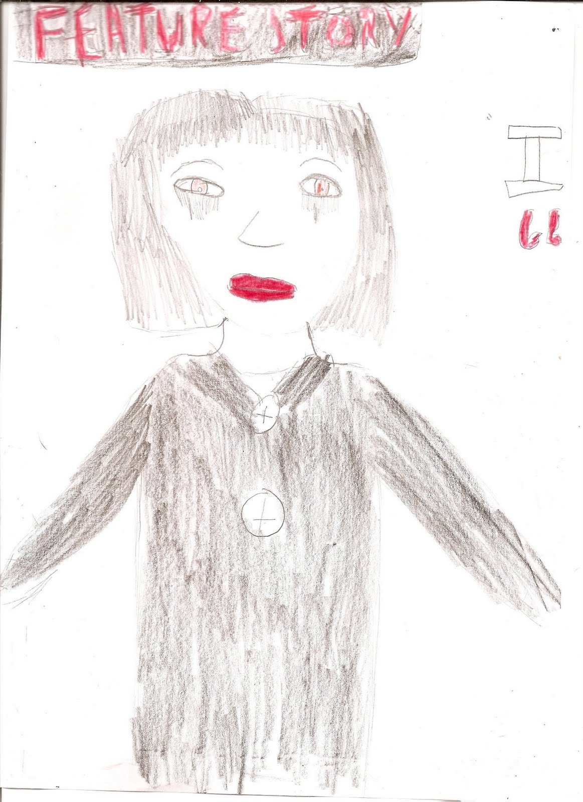
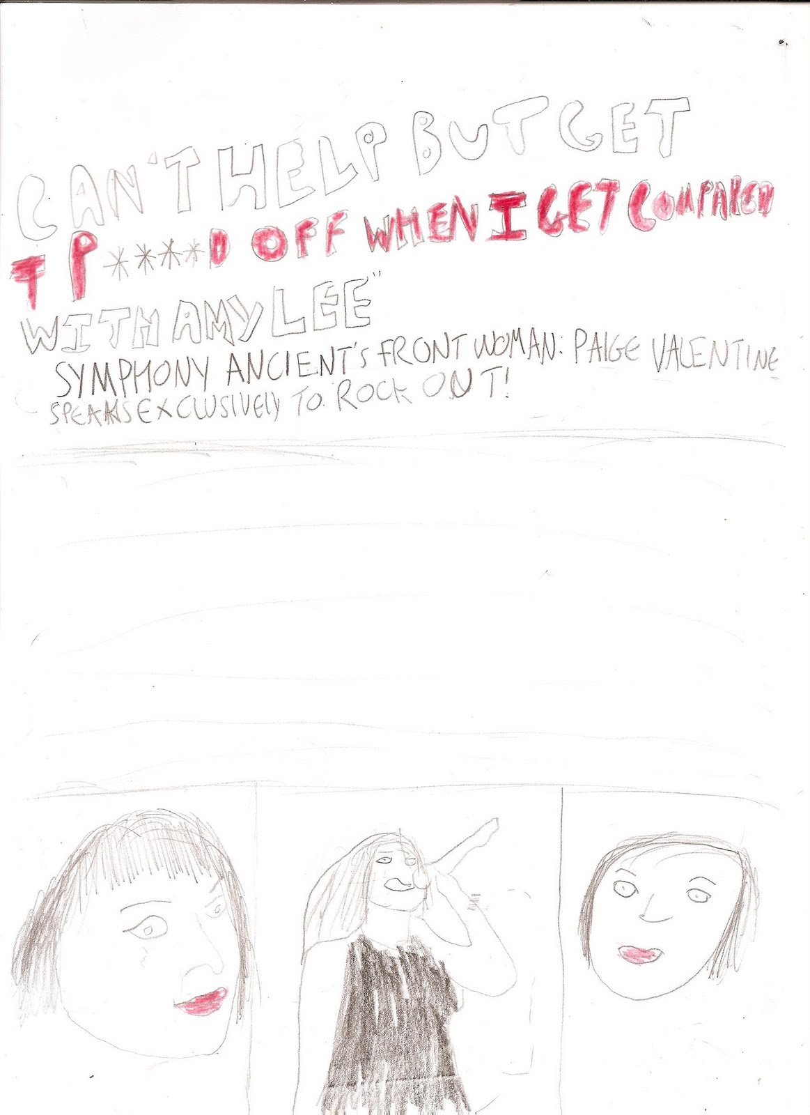
Here is the flatplan for my DPS I added a "Feature Story" banner so the the reader can acknowledge what exactly it is they're reading. I decided to have a photo of my model dominating one page as this is a common occurance in Double Page Spreads in rock magazines. I also decided I'm going to include three additional images of my model on the second page in various shot types. I have also decided that I am going to use three colours in my DPS: Black, white and read to give my magazine a sense of continuity, and additionally the colours work in unison to create a representation of the artist, that the artist is: fierce, rebellious yet very passionate about their music. This is a common representation found within the rock culture.
No comments:
Post a Comment