In order to gain inspiration for how I want my final product to look. I have created flatplans which are rough sketches of my potential ideas. I have sketched a flaplan for: A front cover, contents page and a double page spread.
Front Cover
As stated above this is my front cover. I have decided to call my magazine "Rock Out!" because I feel as though this is a suitable name as it sounds like it would fit into a Rock genre magazine. I am using a 4 colour palette rule of Black, Yellow Red and White as the connotations of the colours all work in unison to construct a representation of the personality traits of the band members featured in the magazine and the target audience. I have placed my sell lines above my main image so that the reader will be able to easily identify them, and acknowledge that the magazine holds value for money. My main sell line is overlapping the image and is significantly larger in size than the rest of the other sell lines so that the reader will be able to identify that this is the main sell line. Also on the bottom left of my magazine i have included a banner which states "111 Reasons to be excited in 2011" although my drawing skills are limited i intend to make this banner represent a paint splash which is a visual metaphor that suggests that the bands mentioned in this article are going to make a "Splash" into the Rock industry and leave a lasting impression on the target audience. The skyline is placed above my masthead and also works as a banner.
Above is my contents page. Here i have included a drawing of an artist who also fits the rock indie streotype, and again eyeline match is used to address the reader. I included the name of the magazine on the top left of the page so that it would be the first part of the contents page the reader will read. I have split the contents page into sections with banners, so the reader will be able to identify which section of the magazine is of their interest. Splitting the magazines into sections seems to be a common feature in rock magazines such as Kerrang! and other various Rock Magazines. I have also decided to use black and yellow as my colours to give the magazine a sense of continuity.
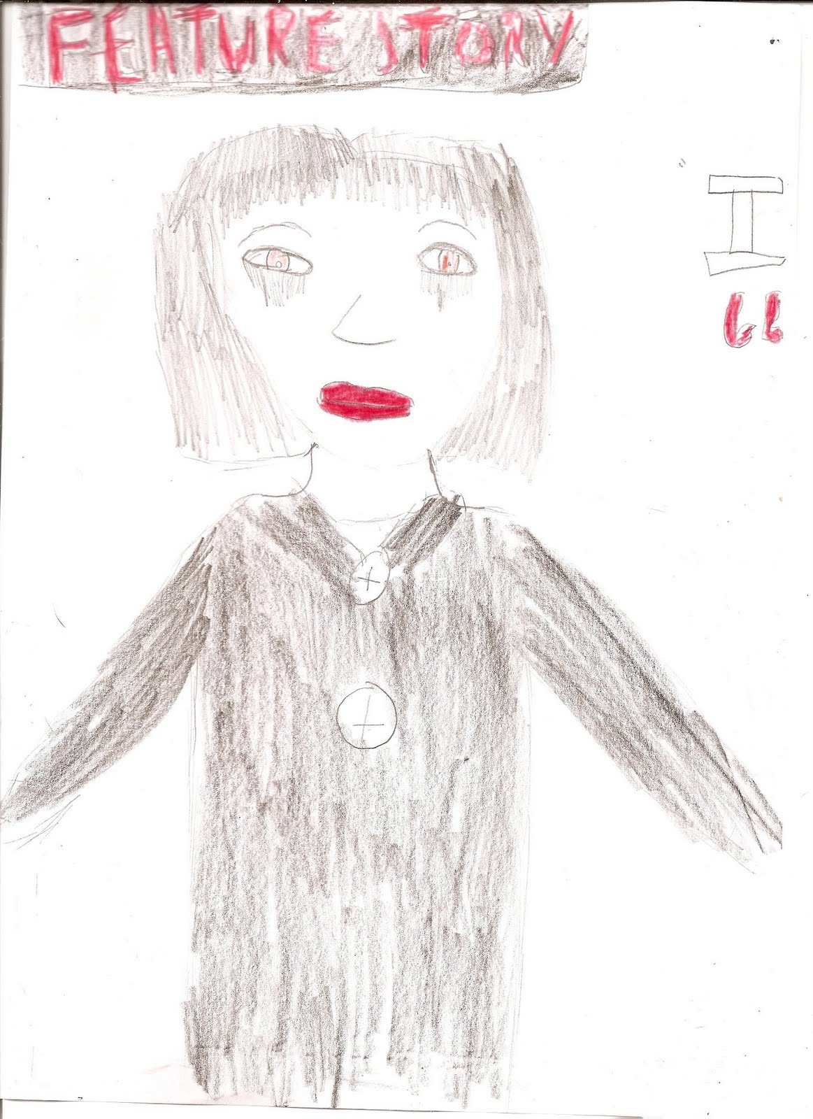
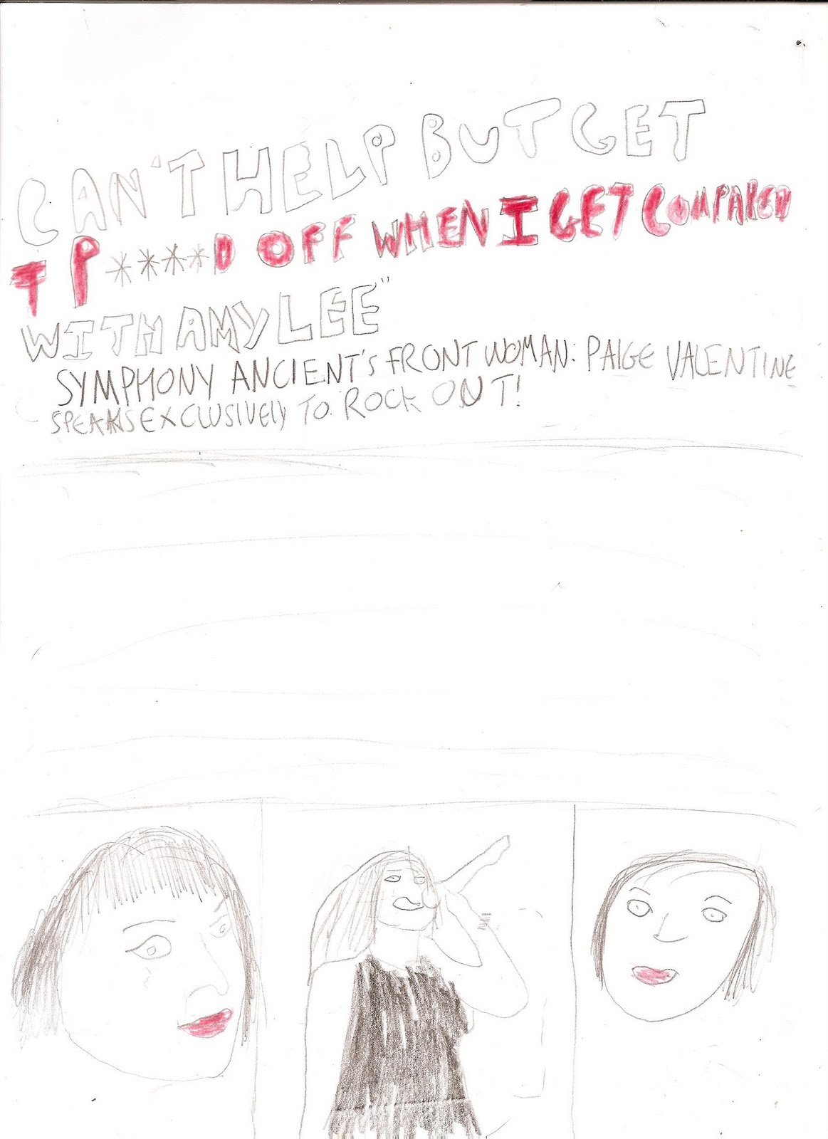
Here is the flatplan for my DPS I added a "Feature Story" banner so the the reader can acknowledge what exactly it is they're reading. I decided to have a photo of my model dominating one page as this is a common occurance in Double Page Spreads in rock magazines. I also decided I'm going to include three additional images of my model on the second page in various shot types. I have also decided that I am going to use three colours in my DPS: Black, white and read to give my magazine a sense of continuity, and additionally the colours work in unison to create a representation of the artist, that the artist is: fierce, rebellious yet very passionate about their music. This is a common representation found within the rock culture.
In order to gain inspiration for how my models should be composed for my final product; I conducted a photography test shoot in a studio setting. I decided to use a general even split of males and females for models because my prior research to the Rock and Indie genre concluded that the general audience for these genres are an even split between males and females. Therefore I used an even split for my models so that it would appeal to both genders.
I used a group shot here, which would be likely to appear in a Double Page Spread. I positioned the models so that if it was to be seen in a double page spread it would be easy for the reader to acknowledge which member of the band takes up the limelight and is therefore the lead singer. I decided to compose my models in this way as prior research had concluded that: In a Rock/Indie magazine, the photos are composed so that the singer is either centrally framed or dominating the foreground is a regular occurrence. Therefore, I challenged this aspect as it is a traditional aspect and by doing so, it would make it easier for the target audience to indentify with the magazine. Eyeline match has also been used so that the reader would feel a direct connection between themselves and the band. This therefore makes the reader feel as though they are personally associated with the band, this therefore increases the chances of the reader wanting to continue reading the article.
Here I used a shot with two models which would either appear in a contents page or a DPS. I decided to pose my models in this way as it connotes that they are: lively, like to have fun and don't take themselves entirely seriously which are the traditional aspects of members of a Rock/Indie band. I decided to compose my models in this particular way as it allows the reader to acknowledge who is the more dominating member of the band. Eyeline match is used between the model who is holding the other model, so that the reader feels as though they can be personally connected.
Here, I used a two shot in medium close up. It is likely to appear in a DPS or a contents page. I positoned one of my models on the left and slighty more towards the foreground, as this would connote that he is the lead singer and takes up most of the media attention and limelight. However the facial expression connotes that he is still reserved and is maybe too shy about being in the limelight. The second model on the rights eyeline would match the reader's which again creates a personal connection. The serious facial expression connotes that he takes his music seriously and views music as a way of a life. This connotation is generally a stereotypical aspect of those associated with a rockband.
This shot is a group shot. It is likely to appear in a DPS. I decided to challenge the traditional features of a photo you would expect to see in a rock/indie magazine, to connote that the band are really something "unique" within the rock industry. The members are generally positioned the same to connote that they are all viewed as equals. Again, eyeline match is used to create a personal connection with the reader.
In order to construct my own target audience for my final product. I am going to research the reader profiles of two well known magazines: Kerrang and NME. When constructing audience research, analysing the reader profile allows the creator of the magazine to segment their audience. Segmenting your audience allows you to create a product which is fit for a suitable audience. This means that the product will sell better as it appeals towards the target audience. Therefore when conducting research on target audience for my final product, I aim to create my own reader profile, then i aim to hold a focus group with a representative sample of my target audience, in order to gain knowledge about their preferences and what they look for in a magazine. This research will therefore, influence my ideas for my final product.
Reader Profile: Kerrang Magazine
The Reader Profile states that the readers of Kerrang Magazine are:
Aged 15 - 24
60% Male 40% Female
Their personality traits are: Sharp, intelligent and appreciate their individuality
The readers are representative of modern day youth
They are "Media Savvy"
They are active consumers of: computer games, media and fashion
They are also active consumers of Music as they on average purchase 31 Albums a year
The Median Age of the audience is aged 19
The age range of the consumers of Kerrang Magazine is "Aged 15 - 24" whilst the median age is 19. There is generally an even split of the gender of the people who purchase this magazine (60% Male 40% Female), however the reader profile suggests that this magazine is therefore aimed more towards males than females. The personality traits of the consumers is believed to represent modern day youth "They rejoice in their individuality" this infers that the magazine is aimed towards the rock/indie/scene kid genre. This analysis of the reader profile implies that if my final product was to challenge the forms and conventions of Kerrang Magazine; I should use a female model on the front cover who falls into the category a "Rock/Indie/Scene stereotype who is around the age of 19. She needs to have an aspect of sex appeal to attract the male readers, but at the same time make the female readers feel proud to be a female.
Reader Profile: NME Magazine
The Reader Profile of NME Magazine states that:
Average age of readers is 24
69% Male 31% Female
52% Work Full Time 7% Work Part Time 29% Are still studying
The readers are "Internet Savvy" With 94% having an internet connection (76% use BroadBand)
The readers are also "Media Savvy" spending a readership total of £45mil on consoles and games. Also 84% receive digital TV or Satellite Channels
The Reader Profile also shows the social standards of their audience, the magazine states that:
45% Spend a lot of money on clothes
92% Agree that it's important to be well informed about things
71% Agree that they believe it's worth paying for extra quality goods
The images surrounding the reader profile also reinforce the traditional traits the NME audience follow such as the "TopShop and TopMan" logos connote that the readers are up to date with the latest fashion trends. Furthermore the "Xbox controller and Mobile phone" connote that the readers are up to date with the latest media products. The Hair Products suggest that NME readers take care/pride in their appearance. The Pepsi, Snickers bar and Jack Daniels connote that the readers lead an unhealthy lifestyle and like to party and get drunk. But it also suggests that they are rebellious by not following the stereotypical healthy lifestyle.
After analysing the reader profile of NME. I have concluded that there is less of an even split of gender who read this magazine when compared to Kerrang with 69% of Males reading the magazine and 31% of females, with an average age of 24. The personality traits of the reader profile are very similar to Kerrang's. NME readers are also "Media Savvy" They use up to date technologies and are aware of the world around them. The magazine infers that it is aimed towards the Rock/Indie Kid stereotype. The overall analysis of NME magazine implies that if i was to challenge the forms and conventions of this magazine in my final product: I should use a male model who falls into the rock/indie stereotype who the male readers can look up and aspire to yet at the same time keep the female's interest. As the readers of NME are older (Average Age 24) the model should be of a similar age in order to keep interest.
Target Audience
As my final product is going to challenge the traditional conventions of a Rock Magazine, i need make sure it's aimed towards an audience who fall under the rock/indie kid "Tribe". In order to be aware of who my target audience are, i must create my own reader profile. Below is a collage I have created on PhotoShop which shows the typical: brands and media which they follow.
Age: Average age 19
Gender: 65% Male 45% Female
Sexuality: Heterosexual
Educational Status: Student
Tribes: Rocker and Indie
Socioeconomic Status: Working - Lower middle class
Behaviours: Media Savvy; Up to date with the world around them; Appreciate their individuality, active consumers of fashion and they are aware of the fashion industry.
I also conducted an interview to gain findings about what people want to see in a magazine.
The research has influenced me in the following ways:
I should use a house style of: Black White and Red as it is appealing
I should split my contents page up into sections, mentioning everything that will be in the magazine to ensure the consumer is getting value for money
I should have more image than text in my double page spread