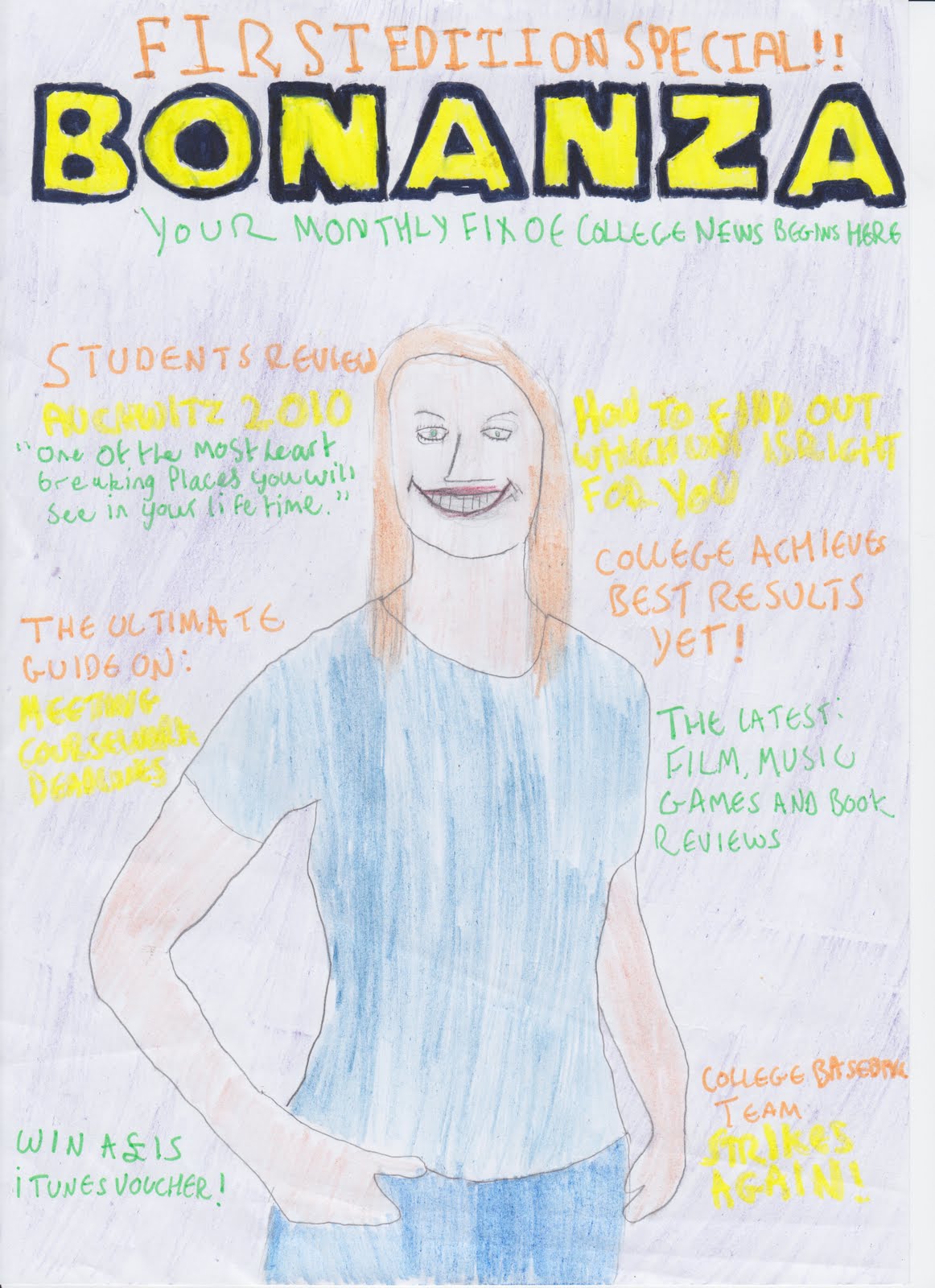
My sell lines are spread out and positioned around the model on my magazine in order to ensure that the audience read each of the sell lines. My mast head is positioned on the top of my magazine page, and fills across the page. Above the mast head is my skyline "First Edition Special". Referring back to the colour scheme, my skyline is in Orange, a contrasting colour. I chosen my skyline to be this colour so that it stands out from the background - making it noticeable that it is a "Special Edition". Additionally, the sell lines which are intended to grab the audiences attention - making them want to buy the magazine are in the contrasting colour "Green" such as "Win a £15 iTunes Voucher". Additionally, I have made my skylines reflected of a college magazine genre, such as "The Ultimate Guide On: Meeting Coursework Deadlines" and a review on a college trip. But in order to keep a wide variety of the audiences interest I have included a skyline for "Film, Music Games and Book reviews". Also, if i was given the opportunity to produce another issue of this magazine it would have the same recognizable theme as it encourages the audience to keep buying further issues. On the photography perspective, the model on my front cover is shot in "Medium Close-up" my choice for this is because most magazines often have the model on a magazine in medium close-up and it is very effective. My model is casually dressed in generic college attire in hope that the audience can relate to the magazine.
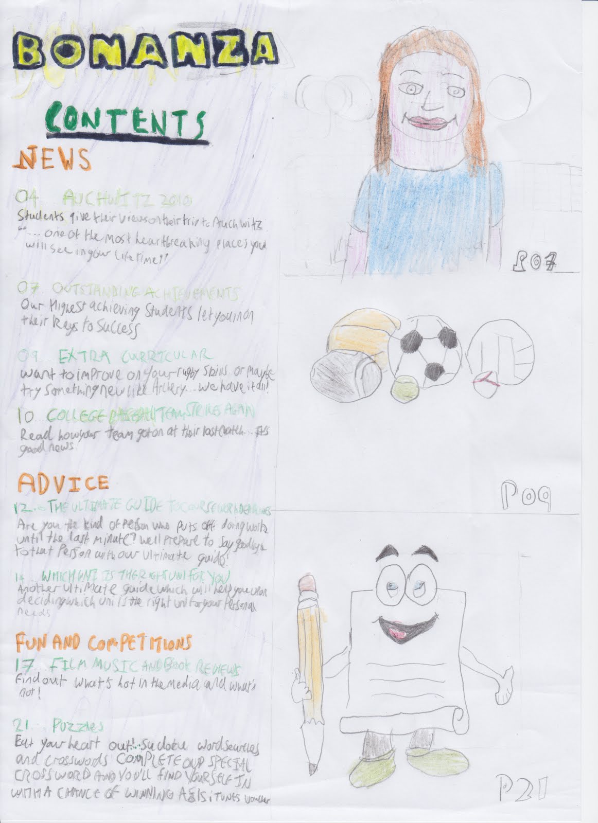
My contents page contains a scaled down version of the mast head and a subheading titled "contents". My contents page is split up into three sections "News, Advice and Fun and Competitions" again, in the colour orange as it stands out. The titles and page numbers are in Green - to grab attention and the the text below the title is in yellow as the attention grabbing colours should encourage the reader to read on. N.B on my flatplan the text is in black as the yellow was difficult to read. Likewise with all magazines, i have included extra articles which were not mentioned on my front page, such as "Extra Curricular". I have also included three photos on my contents page: an alternative photo of my model from the front page, a photo of sports gear and a drawing of a "mascot" representing the puzzles section.
No comments:
Post a Comment