I attempted to challenge my product against the forms and conventions of a real life product. In comparison to "Rolling Stone" magazine, it is evident that the Mastheads are positioned in the same place as one another. However, with my product there's a skyline above my masthead whereas on "Rolling Stone" magazine there is no skyline. In both magazines, the most important sell lines are positioned on the left of the magazine. This is because in western culture we read from left to right. This means the sell lines on the left are the ones which are embedded in our mind first. Therefore on the front cover of my magazine my main sell line is the one on the top left. However on "Rolling Stone magazine" The main sell line appears to be on the bottom left. The main sell line is placed there as it is the last thing that the audience sees, therefore it's fresh in their mind. Also the font is larger than the other sell lines, so it's grabbing the audiences attention too.
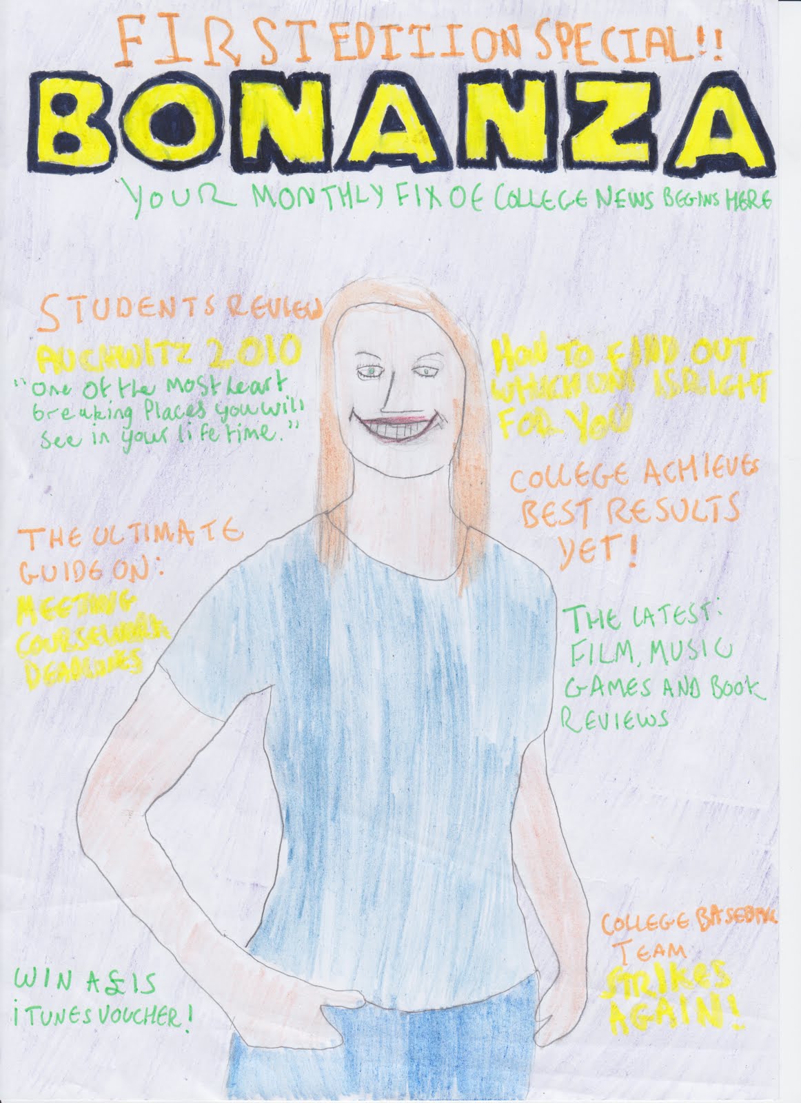
The cooperate colours for my magazine are: purple yellow orange and green. I chose these colours for two reasons: They all contrast/compliment the background colour purple, and the connotations of my colours suggest that the college students buying this magazine are: noble, cheerful, sociable and relaxed. The photograph of my model on my magazine is in medium close up. This is a characteristic of most magazines as medium close up gives the best effect on an audience. The use of a medium close up allows the audience to focus on the expression of the model.With the use of rule of thirds, the positioning of my models eyes are directed so it looks as though she is looking at the reader. This adds a personal touch to the magazine as they feel a connection towards the model. The content of my sell lines are typical of a college magazine, as you would expect to see sell lines about "coursework, results and trips" therefore, the audience can easily identify that this is a college magazine. The choice of costume for the model was "Trendy attire", the reason behind this choice of costume is because the "trendy" lifestyle can often be perceived as a desirable lifestyle. Seeing people living the desirable lifestyle enhances the audiences desire to buy the magazine.
For my magazine, I decided to use three different fonts. "ex02 Stencil" (Masthead) "Top Secret" (Skyline) and "Stencil" (Sell lines). I think that these three fonts are very effective for a magazine cover as "Stencil" looks very professional, it's simple to read, and most magazines use a similar style of font for their sell lines. As you can see with "Rollingstone" magazine, they have used a similar font for their sell lines. I think that the use of "ex02 Stencil" for my mast head really makes the magazine title stand out, it's bright, it's bold, it's in your face; whilst not looking unprofessional at the same time. The font "Top Secret" makes my skyline more noticeable as it's in capital letters with double underlining. It also makes the reader acknowledge that the fact it is a "First edition special" is important.
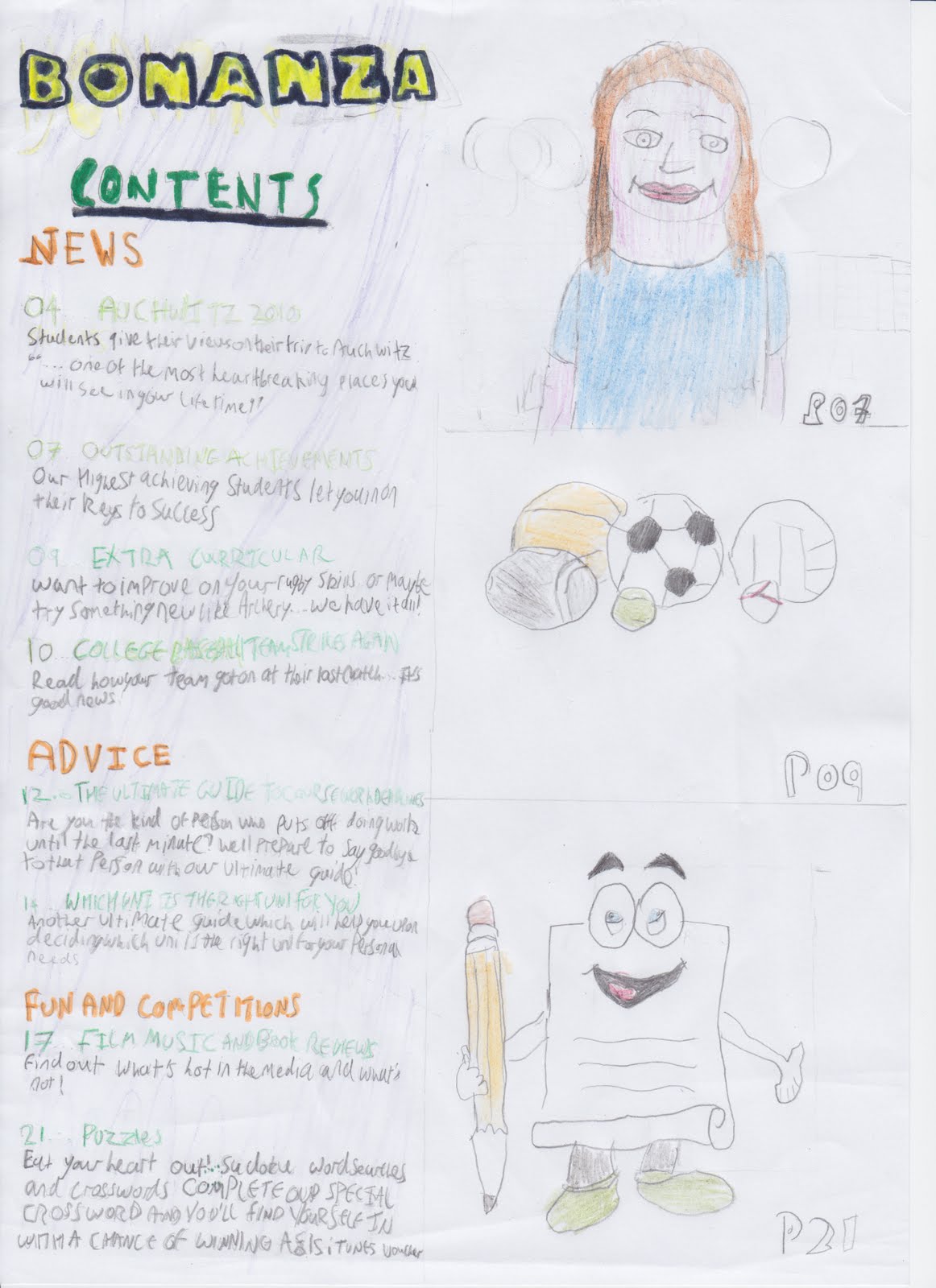
For my contents page, you can see that I have used the same fonts as my front cover. This is because if i decided to use totally different fonts, it would look like a contents page for a totally different magazine and this would confuse the audience! I included a scaled down version of my masthead, as it's a characteristic of most content's pages. As you can see in "Bazaar" magazine. The content of my contents page is placed on the left hand side as in western culture, you read from top left to bottom right so it is the first thing the reader sees. Similarly "Bazaar" does this too. I used two alternative photos of my model, and a photo of Darlington Arts Centre. I think that the fact the reader sees additional photos of the model when they open magazine allows them to feel even more of a personal connection with the model.
I represented the student body on my magazine as the stereotype "Trendy". Below is a fact file which i created on trendies, and a video from YouTube about trendies.
With the use of my product, i have tried to reinforce peoples perceptions about students,with the use of costume; as you can see my model is wearing fashionable clothes, and lots of jewelery on her arm, which are characteristics of the trendy stereotype. Additionally, the poses that my model is doing (both on my front cover and my contents page) are the stereotypical poses you would see trendy people do when getting their photo taken; since trendies are renowned for being posers too!
Next, I conducted my own research about who my target audience could be. I began my research by interviewing my friends about their lifestyle on the social networking site, Facebook. Below are a few examples of the lifestyles of people I interviewed, who i believe fall into the "Trendy" Stereotype.
As you can see, the three people on the document lead the trendy lifestyle. Both Amanda, and Paige like High street clothing, which was mentioned as one the characteristics of the trendy life style on both the Fact File I created, and on the YouTube video. Also Nathan says that his fashion choice is Effeminate, meaning that he likes to dress in clothes such as skinny jeans, another characteristic, on the Fact File and the Video.
Knowing specifically who my target audience are, makes it a lot easier to produce a product for them. As I based my product on stereotypes, I already know what their interests are and how to cater for them. I was highly influenced by target audience when deciding the costume for my model. I wanted to have a model who dressed trendy also, making it easier for the audience to identify themselves with both the model and the magazine. I think the choice of colours also attract the target audience to the product too, not only do they stand out because they are contrasting colours, the connotations as mentioned before, also represent the trendy stereotype. I also think that the layout of my product helps the audience to identify themselves with the magazine too. As you can see, the layout is similar to "Vogue Magazine" a magazine which a lot of Trendy people (in particular, females buy). As the layout is familiar, it helps to give my magazine a more welcoming feeling for my audience.
I also wanted the views of what people from the real world thought about my magazine, so I uploaded my front cover to Facebook, and asked people to tell me what they liked/disliked about it and I also requested for them to give me constructive criticism; so I know how I can improve the flaws in my product for next time.
I now know that the choice of colours were a success, apart from the fact that some people struggled to read the green. However, I know that if i was to make this product again, i should choose a brighter green. I also know that my main sell line is obvious and that you can see slightly where i cut my model out from my background. It has also been suggested that i should of had the title positioned behind my model. I think that this was a very good suggestion as many magazines use this technique
Although I did not ask for peoples opinions of the contents page on Facebook, I can identify some flaws myself, which can be improved for next time. Unfortunately, the middle picture on my contents page is out of proportion to the other two, I did not realise this until i had uploaded the contents page as a final product. I now know that I need to be more careful next time. Also, some of the text varies in size, i think this looks slightly unprofessional upon second glance. However, I do think it's good that I used the same fonts, and that there is more photos of the model, inside. As it creates a more personal feel between the audience and the model.
Upon creating this product, I have learned so much about different technologies. First of all, my product was created on Apple Mac; previously I had never used one in my life and wouldn't know how to; and due to using an Apple Mac, I know what it's like for people in the Media industry to produce products, as people in the industry use them. I also learned how to use this website, blogger itself; beforehand I had never wrote a blog in my life and did not no how to. Additionally, I advanced my skills in photoshop; I had never made a magazine before so it was very good to learn how to. Also I never knew how to use guidelines in photoshop, and now i believe it is essential to know how to use guidelines efficiently, as without them the text on the sell lines could of easily gone off the page. Similarly I learned about the program Adobe InDesign, this program was new to me and I think that using the program to create my contents page benefited, as, InDesign can allow you to plan out where everything can be place much easier, with the use of picture boxes and text boxes. Finally, I gained knowledge about photography, previously I did not know about the rule of thirds and how to use a professional camera. My product gained a lot with the use of a professional camera, a professional camera can make the photo of the model a higher quality, which coincidentally makes the product look more professional itself.
My cooperate colours for my magazine are: Purple, Orange, Green and Yellow. I have decided to use purple as the background and have the other colours used for the sell lines and title. The reason i decided to this is because Orange and Green are colours which contrast against purple and Yellow is a supplementary colour. The use of contrasting colours on sell lines is beneficial when trying to sell a magazine as it makes the sell lines stand out, therefore it's grasping the audiences attention.
My sell lines are spread out and positioned around the model on my magazine in order to ensure that the audience read each of the sell lines. My mast head is positioned on the top of my magazine page, and fills across the page. Above the mast head is my skyline "First Edition Special". Referring back to the colour scheme, my skyline is in Orange, a contrasting colour. I chosen my skyline to be this colour so that it stands out from the background - making it noticeable that it is a "Special Edition". Additionally, the sell lines which are intended to grab the audiences attention - making them want to buy the magazine are in the contrasting colour "Green" such as "Win a £15 iTunes Voucher". Additionally, I have made my skylines reflected of a college magazine genre, such as "The Ultimate Guide On: Meeting Coursework Deadlines" and a review on a college trip. But in order to keep a wide variety of the audiences interest I have included a skyline for "Film, Music Games and Book reviews". Also, if i was given the opportunity to produce another issue of this magazine it would have the same recognizable theme as it encourages the audience to keep buying further issues. On the photography perspective, the model on my front cover is shot in "Medium Close-up" my choice for this is because most magazines often have the model on a magazine in medium close-up and it is very effective. My model is casually dressed in generic college attire in hope that the audience can relate to the magazine.
My contents page contains a scaled down version of the mast head and a subheading titled "contents". My contents page is split up into three sections "News, Advice and Fun and Competitions" again, in the colour orange as it stands out. The titles and page numbers are in Green - to grab attention and the the text below the title is in yellow as the attention grabbing colours should encourage the reader to read on. N.B on my flatplan the text is in black as the yellow was difficult to read. Likewise with all magazines, i have included extra articles which were not mentioned on my front page, such as "Extra Curricular". I have also included three photos on my contents page: an alternative photo of my model from the front page, a photo of sports gear and a drawing of a "mascot" representing the puzzles section.


